Aura
<quiet-aura>
Extracts the dominant colors from an image and exposes them as CSS custom properties on the host. Use an aura to tint backgrounds, glows, and text around album art, hero images, and product shots so the surrounding UI feels connected to the picture.
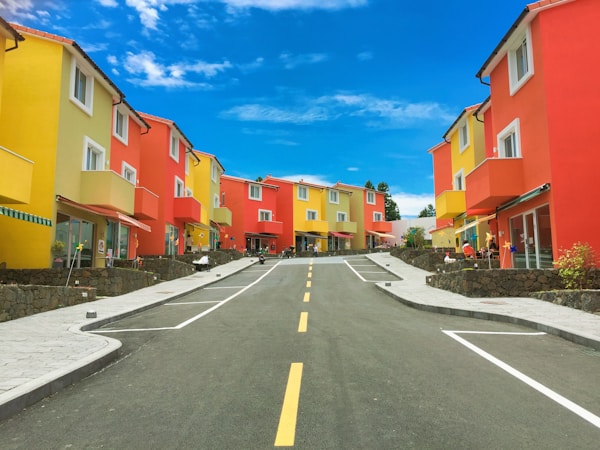
<quiet-aura id="aura__overview" src="https://images.unsplash.com/photo-1475746812396-2b046c18be0e?w=600" count="3">
<div class="stage">
<!-- Background layers -->
<div class="bg"></div>
<div class="glow"></div>
<!-- Album -->
<div class="album">
<div class="album-cover">
<img src="https://images.unsplash.com/photo-1475746812396-2b046c18be0e?w=600" alt="" crossorigin="anonymous" />
</div>
<div class="album-glow" aria-hidden="true"></div>
</div>
<!-- Text -->
<div class="meta">
<h2>Color Theory</h2>
<p>Chromatic Sessions • 2026</p>
</div>
<!-- Thumbnails -->
<div class="thumbs">
<button class="active">
<img
src="https://images.unsplash.com/photo-1475746812396-2b046c18be0e?w=600"
alt="Color Theory"
data-artist="Chromatic Sessions • 2026" crossorigin="anonymous"
/>
</button>
<button>
<img
src="https://images.unsplash.com/photo-1518837695005-2083093ee35b?w=600"
alt="Ocean Drive"
data-artist="Coastal Beats • 2025" crossorigin="anonymous"
/>
</button>
<button>
<img
src="https://images.unsplash.com/photo-1473448912268-2022ce9509d8?w=600"
alt="Canopy"
data-artist="Forest Floor • 2024" crossorigin="anonymous"
/>
</button>
<button>
<img
src="https://images.unsplash.com/photo-1509316785289-025f5b846b35?w=600"
alt="Golden Hour"
data-artist="Desert Winds • 2026" crossorigin="anonymous"
/>
</button>
</div>
</div>
</quiet-aura>
<style>
#aura__overview {
opacity: 0;
transition: opacity 0.8s ease;
&:state(extracted) {
opacity: 1;
}
.stage {
position: relative;
display: flex;
flex-direction: column;
align-items: center;
justify-content: center;
padding: 4rem 2rem 2.5rem;
overflow: hidden;
min-height: 520px;
}
/* Mesh gradient background built from extracted colors */
.bg {
position: absolute;
inset: 0;
background:
radial-gradient(ellipse 120% 80% at 20% 10%, var(--color-1), transparent 60%),
radial-gradient(ellipse 100% 100% at 80% 80%, var(--color-2), transparent 50%),
radial-gradient(ellipse 80% 120% at 50% 50%, var(--color-3), transparent 70%),
var(--color-1);
filter: saturate(1.2);
}
/* Large soft glow behind the album */
.glow {
position: absolute;
width: 500px;
height: 500px;
top: 50%;
left: 50%;
translate: -50% -55%;
border-radius: 50%;
background: radial-gradient(
circle,
color-mix(in srgb, var(--color-1) 40%, transparent) 0%,
color-mix(in srgb, var(--color-2) 20%, transparent) 40%,
transparent 70%
);
filter: blur(30px);
pointer-events: none;
}
.album {
position: relative;
z-index: 1;
width: 280px;
.album-cover {
position: relative;
border-radius: 8px;
overflow: hidden;
box-shadow:
0 4px 20px rgb(0 0 0 / 0.4),
0 0 0 1px rgb(255 255 255 / 0.08) inset;
img {
display: block;
width: 100%;
aspect-ratio: 1 / 1;
object-fit: cover;
}
}
}
/* Colored glow behind the album cover */
.album-glow {
position: absolute;
inset: 10%;
z-index: -1;
border-radius: 16px;
background: var(--color-1);
filter: blur(40px) saturate(1.5);
opacity: 0.75;
}
.meta {
position: relative;
z-index: 1;
text-align: center;
color: var(--text-1, white);
margin-top: 0.75rem;
h2 {
margin: 0;
font-size: 1.35rem;
letter-spacing: 0.02em;
text-shadow: 0 1px 8px rgb(0 0 0 / 0.4);
}
p {
margin: 0.25rem 0 0;
font-size: 0.85rem;
opacity: 0.6;
}
}
.thumbs {
position: relative;
z-index: 1;
display: flex;
gap: 8px;
margin-top: 1.5rem;
button {
all: unset;
cursor: pointer;
border-radius: .5rem;
overflow: hidden;
opacity: 0.5;
transition: opacity 0.3s ease;
border: solid 2px transparent;
padding: 1px;
@media (hover: hover) {
&:hover {
opacity: 1;
}
}
&.active {
opacity: 1;
border-color: white;
}
&:focus-visible {
border-color: black;
opacity: 1;
}
img {
display: block;
border-radius: .33rem;
width: 3.5rem;
aspect-ratio: 1 / 1;
object-fit: cover;
}
}
}
}
</style>
<script>
const aura = document.getElementById('aura__overview');
const albumImg = aura.querySelector('.album img');
const title = aura.querySelector('.meta h2');
const artist = aura.querySelector('.meta p');
const thumbs = aura.querySelectorAll('.thumbs button');
thumbs.forEach(thumb => {
thumb.addEventListener('click', () => {
thumbs.forEach(t => t.classList.remove('active'));
thumb.classList.add('active');
const img = thumb.querySelector('img');
aura.src = img.src;
albumImg.src = img.src;
title.textContent = img.alt;
artist.innerHTML = img.dataset.artist;
});
});
</script>
Examples Jump to heading
Providing an image Jump to heading
The src attribute tells the component which image to analyze, but it doesn't render anything.
Based on this image, the appropriate CSS custom properties are set. You'll typically want to add an
<img> element to display the image, too. Using the same URL for both is perfectly fine.
For cross-origin images, add crossorigin="anonymous" to your display
<img> so the browser can share a single cached response with the component's internal
image, which requires CORS to read pixel data.
The properties you'll usually reach for are the semantic colors. Each describes a meaningful role
in the image and has a matching --text-* property for optimal contrast.
--color-dominant- The most prominent color in the image-
--color-accent- The most vivid color that's distinct from the dominant, well suited to highlights and glows --color-dark- The darkest extracted color--color-light- The lightest extracted color--color-avg- The average of every pixel, well suited to a calm background wash
Every property resolves to a usable color, even for a single-color image where some of them will be the
same. When no color is distinct enough to serve as an accent, --color-accent falls back to the
dominant color, so var(--color-accent) is always safe to use.
<!-- Create an aura that analyzes a photo -->
<quiet-aura src="photo.jpg">
  <!-- Add crossorigin="anonymous" to share the cached CORS response -->
  <img src="photo.jpg" alt="A scenic landscape" crossorigin="anonymous" />

  <!-- Use semantic colors to theme surrounding content -->
  <div style="background: var(--color-dominant); color: var(--text-dominant);">
    This text will have a background color and an appropriate text color.
  </div>
</quiet-aura>
<quiet-aura id="aura__semantic" src="https://images.unsplash.com/photo-1509316785289-025f5b846b35?w=600">
  <img src="https://images.unsplash.com/photo-1509316785289-025f5b846b35?w=600" alt="Golden hour over the desert" crossorigin="anonymous" />
  <div class="swatches">
    <span style="background: var(--color-dominant); color: var(--text-dominant);">Dominant</span>
    <span style="background: var(--color-accent); color: var(--text-accent);">Accent</span>
    <span style="background: var(--color-dark); color: var(--text-dark);">Dark</span>
    <span style="background: var(--color-light); color: var(--text-light);">Light</span>
    <span style="background: var(--color-avg); color: var(--text-avg);">Average</span>
  </div>
</quiet-aura>

<style>
  #aura__semantic {
    display: flex;
    flex-direction: column;
    align-items: center;
    gap: 1rem;
    padding: 1rem;

    & > img {
      display: block;
      max-width: 400px;
      aspect-ratio: 3 / 2;
      object-fit: cover;
      border-radius: var(--quiet-border-radius-lg);
    }

    .swatches {
      display: flex;
      flex-wrap: wrap;
      justify-content: center;
      gap: 0.25rem;
    }

    .swatches span {
      width: 4.5rem;
      height: 2.25rem;
      border-radius: var(--quiet-border-radius-sm);
      display: flex;
      align-items: center;
      justify-content: center;
      font-size: 0.75rem;
      font-weight: var(--quiet-font-weight-semibold);
    }
  }
</style>
Images loaded from a different origin must be served with
CORS
(Access-Control-Allow-Origin). Most CDNs and image services support this. If the image can't
be read due to CORS restrictions, any fallback colors you've set will be used instead.
Positional colors Jump to heading
If you'd rather work with the raw palette, every extracted color is also available as a numbered, or
positional, property. These follow the sort order and are handy when you want to lay
out the whole palette or drive multiple layers from different colors.
-
--color-N— The Nth extracted color as a hex value, e.g.--color-1,--color-2, etc. -
--text-N— Eitherblackorwhite, chosen for optimal contrast against--color-N
By default, five colors are extracted. Use the count attribute to request anywhere from 1 to 10
colors, e.g. count="3" will set --color-1 through
--color-3 along with --text-1 through --text-3.
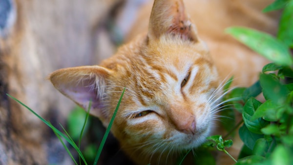
<quiet-aura id="aura__positional" src="https://images.unsplash.com/photo-1671707696618-ca0685b0012e?w=600">
  <img src="https://images.unsplash.com/photo-1671707696618-ca0685b0012e?w=600" alt="An orange cat smiles up at the camera" crossorigin="anonymous" />
  <div class="swatches">
    <span style="background: var(--color-1); color: var(--text-1);">1</span>
    <span style="background: var(--color-2); color: var(--text-2);">2</span>
    <span style="background: var(--color-3); color: var(--text-3);">3</span>
    <span style="background: var(--color-4); color: var(--text-4);">4</span>
    <span style="background: var(--color-5); color: var(--text-5);">5</span>
  </div>
</quiet-aura>

<style>
  #aura__positional {
    display: flex;
    flex-direction: column;
    align-items: center;
    gap: 1rem;
    padding: 1rem;

    & > img {
      display: block;
      max-width: 400px;
      aspect-ratio: 3 / 2;
      object-fit: cover;
      border-radius: var(--quiet-border-radius-lg);
    }

    .swatches {
      display: flex;
      flex-wrap: wrap;
      justify-content: center;
      gap: 0.25rem;
    }

    .swatches span {
      width: 4.5rem;
      height: 2.25rem;
      border-radius: var(--quiet-border-radius-sm);
      display: flex;
      align-items: center;
      justify-content: center;
      font-size: 0.75rem;
      font-weight: var(--quiet-font-weight-semibold);
    }
  }
</style>
Providing fallback colors Jump to heading
During the :state(loading) and :state(error) states, all color properties default
to safe theme values so content is always visible. You can set your own fallback colors by targeting the
loading and error states and assigning custom values.
/* Override fallback colors during loading and on error */
quiet-aura:state(loading),
quiet-aura:state(error) {
  --color-1: #6b7280;
  --color-2: #9ca3af;
  --text-1: white;
  --text-2: white;
}
Exploring extracted colors Jump to heading
Set sort to change the order of extracted colors and count to control how many are
extracted (1–10). Try changing the controls below to see how they affect the palette.
<quiet-aura id="aura__palette" src="https://images.unsplash.com/photo-1589883661923-6476cb0ae9f2?w=600" count="4">
  <img src="https://images.unsplash.com/photo-1589883661923-6476cb0ae9f2?w=600" alt="Colorful umbrellas" crossorigin="anonymous" />
  <div class="swatches"></div>
  <div class="controls">
    <quiet-select id="aura__palette-sort" label="Sort" value="dominance">
      <option value="dominance">Dominance</option>
      <option value="hue">Hue</option>
      <option value="light-to-dark">Light to dark</option>
      <option value="dark-to-light">Dark to light</option>
    </quiet-select>
    <quiet-number-input id="aura__palette-slider" label="Count" min="1" max="10" value="4" with-markers with-tooltip></quiet-number-input>
  </div>
</quiet-aura>

<style>
  #aura__palette {
    display: flex;
    flex-direction: column;
    align-items: center;
    gap: 1rem;
    padding: 1rem;

    & > img {
      display: block;
      max-width: 400px;
      aspect-ratio: 3 / 2;
      object-fit: cover;
      border-radius: var(--quiet-border-radius-lg);
    }

    .controls {
      display: flex;
      gap: 1rem;
      align-self: stretch;

      & quiet-number-input {
        max-width: 200px;
      }
    }

    .swatches {
      display: flex;
      flex-wrap: wrap;
      gap: 0.25rem;
    }

    .swatch {
      width: 4.5rem;
      height: 2.25rem;
      border-radius: var(--quiet-border-radius-sm);
      display: flex;
      align-items: center;
      justify-content: center;
      font-size: 0.75rem;
      font-weight: var(--quiet-font-weight-semibold);
    }
  }
</style>

<script type="module">
  import { allDefined } from '/dist/quiet.js';
  const aura = document.getElementById('aura__palette');
  const slider = document.getElementById('aura__palette-slider');
  const sortSelect = document.getElementById('aura__palette-sort');
  const swatches = aura.querySelector('.swatches');

  function renderSwatches(colors) {
    swatches.innerHTML = '';

    colors.forEach(color => {
      const swatch = document.createElement('div');
      swatch.className = 'swatch';
      swatch.style.background = color.hex;
      swatch.style.color = color.textColor;
      swatch.textContent = color.hex;
      swatches.appendChild(swatch);
    });
  }

  await allDefined();

  // Handle colors already extracted (e.g. navigating here via Turbo)
  if (aura.colors.length > 0) {
    renderSwatches(aura.colors);
  }

  aura.addEventListener('quiet-loaded', () => {
    renderSwatches(aura.colors);
  });

  slider.addEventListener('quiet-input', () => {
    aura.count = slider.value;
  });

  sortSelect.addEventListener('quiet-change', () => {
    aura.sort = sortSelect.value;
  });
</script>
Changing the number of colors may cause existing colors to shift. This is expected behavior. The quantization algorithm divides the image's color space differently depending on the target count, so the same "slot" may represent a different region of colors.
Extracted colors are also available as objects through the colors property. Since extraction is
asynchronous, wait for the quiet-loaded before accessing them. The property will be an empty
array before extraction.
const aura = document.querySelector('quiet-aura');

aura.addEventListener('quiet-loaded', () => {
  console.log(aura.colors); // [{ hex, rgb, luminance, textColor }, …]
});
Using OKLCH components Jump to heading
Add the with-oklch attribute to decompose each extracted color into:
--color-N-l(lightness, 0–1)--color-N-c(chroma, 0–0.4)--color-N-h(hue, 0–360)
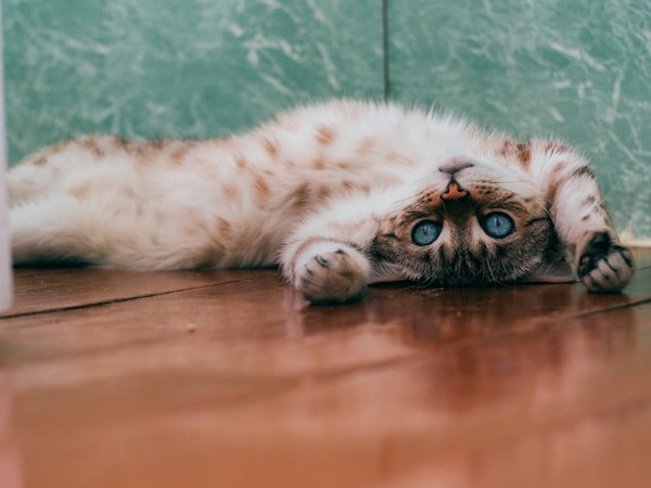
OKLCH is perceptually uniform, so adjusting lightness produces natural results without the hue shifts that HSL is known for. In this example, a single extracted hue drives every color in the card. The badge, heading, body text, tags, and button each use a different lightness to create visual hierarchy, all in pure CSS.

Golden Hour
A kitten soaking up the warmth of a lazy afternoon. Every color in this card is derived from a single extracted hue.
<quiet-aura id="aura__oklch" src="https://images.unsplash.com/photo-1536500152107-01ab1422f932?q=80&w=600&auto=format&fit=crop" count="1" with-oklch>
  <div class="layout">
    <img src="https://images.unsplash.com/photo-1536500152107-01ab1422f932?q=80&w=600&auto=format&fit=crop" alt="A kitten stares at the camera in front of a yellow wall" crossorigin="anonymous" />
    <div class="content">
      <div class="badge">Editor's Choice</div>
      <h2>Golden Hour</h2>
      <p>A kitten soaking up the warmth of a lazy afternoon. Every color in this card is derived from a single extracted hue.</p>
      <div class="tags">
        <span>Cats</span>
        <span>Cozy</span>
        <span>Warm</span>
      </div>
      <button>View Gallery</button>
    </div>
  </div>
</quiet-aura>

<style>
  #aura__oklch {
    opacity: 0;
    transition: opacity 0.8s ease;

    &:state(extracted) {
      opacity: 1;
    }

    .layout {
      display: flex;
      /* Very light tint of the extracted hue */
      background: oklch(0.96 0.02 var(--color-1-h));
      border-radius: 2rem;
      overflow: hidden;

      img {
        display: block;
        width: 280px;
        object-fit: cover;
        flex-shrink: 0;
        border-radius: 0;
      }

      @media (max-width: 600px) {
        flex-direction: column;

        img {
          width: 100%;
          max-height: 200px;
        }
      }
    }

    .content {
      flex: 1;
      padding: 2rem 2.5rem;
      display: flex;
      flex-direction: column;
      align-items: flex-start;
      gap: 0.75rem;
    }

    .badge {
      padding: 0.25rem 0.6rem;
      border-radius: 999px;
      background: oklch(0.92 0.03 var(--color-1-h));
      color: oklch(0.4 var(--color-1-c) var(--color-1-h));
    }

    h2 {
      margin: 0;
      color: oklch(0.3 var(--color-1-c) var(--color-1-h));
    }

    p {
      margin: 0;
      color: oklch(0.45 0.03 var(--color-1-h));
    }

    .tags {
      display: flex;
      gap: 0.5rem;
      margin-top: 0.25rem;

      span {
        padding: 0.2rem 0.7rem;
        border-radius: 999px;
        border: solid 2px oklch(0.9 0.03 var(--color-1-h));
        color: oklch(0.4 var(--color-1-c) var(--color-1-h));
      }
    }

    button {
      cursor: pointer;
      margin-block-start: 1rem;
      border-radius: 9999px;
      background: oklch(0.5 var(--color-1-c) var(--color-1-h));
      color: white;
      box-shadow: 0 3px 0 oklch(0.35 var(--color-1-c) var(--color-1-h));

      &:hover {
        background: oklch(0.42 var(--color-1-c) var(--color-1-h));
      }

      &:focus-visible {
        outline-color: var(--color-1);
      }
    }
  }
</style>
You can also use OKLCH components to generate an entire palette from a single extracted color. By varying only the lightness while keeping the hue and chroma fixed, you get a range of shades that feel naturally related.
<quiet-aura id="aura__palette-oklch" src="https://images.unsplash.com/photo-1536500152107-01ab1422f932?q=80&w=600&auto=format&fit=crop" count="1" with-oklch>
  <div class="swatches">
    <div class="swatch" style="background: var(--shade-1); color: white;">1</div>
    <div class="swatch" style="background: var(--shade-2); color: white;">2</div>
    <div class="swatch" style="background: var(--shade-3); color: white;">3</div>
    <div class="swatch" style="background: var(--shade-4); color: white;">4</div>
    <div class="swatch" style="background: var(--shade-5); color: white;">5</div>
    <div class="swatch" style="background: var(--shade-6); color: black;">6</div>
    <div class="swatch" style="background: var(--shade-7); color: black;">7</div>
    <div class="swatch" style="background: var(--shade-8); color: black;">8</div>
    <div class="swatch" style="background: var(--shade-9); color: black;">9</div>
    <div class="swatch" style="background: var(--shade-10); color: black;">10</div>
  </div>
</quiet-aura>

<style>
  #aura__palette-oklch {
    /* Generate 10 shades from the extracted hue */
    --shade-1: oklch(0.23 var(--color-1-c) var(--color-1-h));
    --shade-2: oklch(0.31 var(--color-1-c) var(--color-1-h));
    --shade-3: oklch(0.39 var(--color-1-c) var(--color-1-h));
    --shade-4: oklch(0.47 var(--color-1-c) var(--color-1-h));
    --shade-5: oklch(0.55 var(--color-1-c) var(--color-1-h));
    --shade-6: oklch(0.63 var(--color-1-c) var(--color-1-h));
    --shade-7: oklch(0.71 var(--color-1-c) var(--color-1-h));
    --shade-8: oklch(0.79 var(--color-1-c) var(--color-1-h));
    --shade-9: oklch(0.87 var(--color-1-c) var(--color-1-h));
    --shade-10: oklch(0.95 var(--color-1-c) var(--color-1-h));

    .swatches {
      display: flex;
      gap: 1px;
      border-radius: var(--quiet-border-radius-lg);
      overflow: hidden;
    }

    .swatch {
      flex: 1;
      aspect-ratio: 1 / 1.5;
      display: flex;
      align-items: end;
      justify-content: center;
      padding-bottom: 0.5rem;
      font-size: 0.65rem;
      font-weight: var(--quiet-font-weight-semibold);
    }
  }
</style>
Ambient backgrounds Jump to heading
Layer radial gradients from extracted colors to build immersive, image-driven backgrounds. Mixing extracted
colors with black using color-mix() creates darker tones suited for cinematic layouts. The
--text-N properties automatically resolve to black or white so text stays readable.

Aurora
The northern sky comes alive with ribbons of light dancing above a frozen landscape. A cinematic journey into the polar night.
<quiet-aura id="aura__cinema" src="https://images.unsplash.com/photo-1563547257011-054b1054e185?q=80&w=600&auto=format&fit=crop" count="5">
  <div class="stage">
    <div class="bg"></div>
    <div class="content">
      <img src="https://images.unsplash.com/photo-1563547257011-054b1054e185?q=80&w=600&auto=format&fit=crop" alt="" crossorigin="anonymous" />
      <div class="details">
        <div class="label">Featured</div>
        <h2>Aurora</h2>
        <p>The northern sky comes alive with ribbons of light dancing above a frozen landscape. A cinematic journey into the polar night.</p>
        <button class="quiet-pill">
          <quiet-icon name="player-play" family="filled"></quiet-icon>
          Play Now
        </button>
      </div>
    </div>
  </div>
</quiet-aura>

<style>
  #aura__cinema {
    opacity: 0;
    transition: opacity 0.8s ease;

    &:state(extracted) {
      opacity: 1;
    }

    .stage {
      position: relative;
      display: flex;
      align-items: center;
      justify-content: center;
      padding: 3rem 2rem;
      min-height: 380px;
      overflow: hidden;
    }

    /* Darkened mesh gradient using color-mix() */
    .bg {
      position: absolute;
      inset: 0;
      background:
        radial-gradient(ellipse 120% 80% at 25% 15%, color-mix(in srgb, var(--color-1) 60%, black), transparent 55%),
        radial-gradient(ellipse 100% 100% at 80% 75%, color-mix(in srgb, var(--color-3) 50%, black), transparent 50%),
        radial-gradient(ellipse 80% 120% at 50% 50%, color-mix(in srgb, var(--color-5) 40%, black), transparent 65%),
        var(--color-1);
    }

    .content {
      position: relative;
      z-index: 1;
      display: flex;
      gap: 2rem;
      align-items: center;
      max-width: 640px;

      & > img {
        width: 240px;
        aspect-ratio: 1;
        object-fit: cover;
        border-radius: 8px;
        flex-shrink: 0;
        box-shadow:
          0 8px 32px rgb(0 0 0 / 0.5),
          0 0 0 1px rgb(255 255 255 / 0.08) inset;

        @media screen and (max-width: 600px) {
          width: 120px;
        }
      }

      .details {
        color: white;
      }
    }

    .label {
      font-size: 0.75rem;
      text-transform: uppercase;
      letter-spacing: 0.15em;
      opacity: 0.6;
      font-weight: 600;
    }

    h2 {
      margin: 0.25rem 0 0.75rem;
      text-shadow: 0 2px 12px rgb(0 0 0 / 0.4);
    }

    p {
      font-size: 0.875rem;
      opacity: 0.75;
    }

    /* Button styled with extracted colors */
    button {
      background: var(--color-1);
      color: var(--text-1);

      &:focus-visible {
        outline-color: var(--color-1);
      }
    }
  }
</style>
Blending an image into content Jump to heading
Use a gradient overlay to seamlessly blend a hero image into a body region filled with the dominant extracted color.
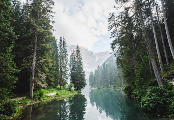
Deep in the heart of an ancient forest, light filters through layers of emerald canopy to paint the floor in shifting patterns. Every step reveals something new — a hidden stream, a shaft of golden light, a world that seems to breathe with the wind.
Some journeys aren't measured in miles but in moments of stillness. This is one of those places where time slows down and the air carries the scent of moss and cedar.
<quiet-aura id="aura__article" src="https://images.unsplash.com/photo-1473448912268-2022ce9509d8?w=600" count="3">
  <div class="hero">
    <img src="https://images.unsplash.com/photo-1473448912268-2022ce9509d8?w=600" alt="" crossorigin="anonymous" />
    <!-- Gradient that melts the image into the body below -->
    <div class="fade"></div>
    <div class="meta">
      <h2>Into the Green</h2>
      <p>May 2026 · 8 min read</p>
    </div>
  </div>
  <div class="body">
    <p>Deep in the heart of an ancient forest, light filters through layers of emerald canopy to paint the floor in shifting patterns. Every step reveals something new — a hidden stream, a shaft of golden light, a world that seems to breathe with the wind.</p>
    <p>Some journeys aren't measured in miles but in moments of stillness. This is one of those places where time slows down and the air carries the scent of moss and cedar.</p>
  </div>
</quiet-aura>

<style>
  #aura__article {
    opacity: 0;
    transition: opacity 0.8s ease;

    &:state(extracted) {
      opacity: 1;
    }

    .hero {
      position: relative;

      img {
        display: block;
        width: 100%;
        aspect-ratio: 2.5 / 1;
        object-fit: cover;
        border-radius: 1rem 1rem 0 0;
      }
    }

    /* Blends the bottom of the image into --color-1 */
    .fade {
      position: absolute;
      bottom: 0;
      left: 0;
      right: 0;
      height: 70%;
      background: linear-gradient(to top, var(--color-1, #111), transparent);
    }

    .meta {
      position: absolute;
      bottom: 1.25rem;
      left: 2rem;
      color: var(--text-1, white);

      h2 {
        margin: 0;
        font-size: 1.5rem;
        font-weight: 700;
        text-shadow: 0 1px 6px rgb(0 0 0 / 0.3);
      }

      p {
        margin: 0.25rem 0 0;
        font-size: 0.8rem;
        opacity: 0.7;
      }
    }

    /* Body background matches the gradient's end color */
    .body {
      padding: 1.5rem 2rem 2rem;
      background: var(--color-1, #111);
      color: var(--text-1, white);
      border-radius: 0 0 1rem 1rem;

      p {
        margin: 0 0 1rem;
        line-height: 1.7;
        font-size: 0.9rem;
        opacity: 0.85;
      }
    }
  }
</style>
Photo gallery with adaptive text Jump to heading
Each image gets its own aura, and the --text-1 property automatically resolves to
black or white based on the dominant color's luminance. This means caption text
stays readable regardless of whether the photo is light or dark.
<div id="aura__gallery">
<!-- Yosemite Valley -->
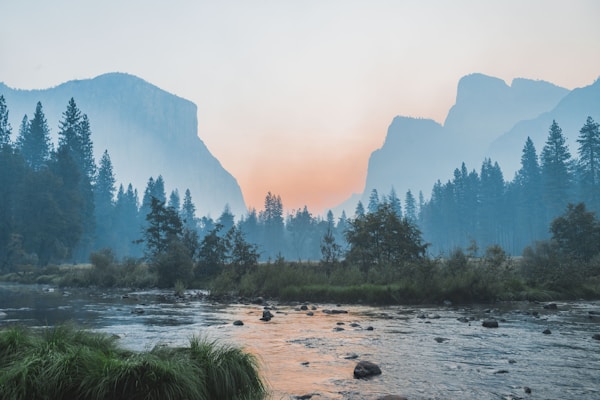
<quiet-aura src="https://images.unsplash.com/photo-1506744038136-46273834b3fb?w=600" count="2">
<div class="card">
<img src="https://images.unsplash.com/photo-1506744038136-46273834b3fb?w=600" alt="" crossorigin="anonymous" />
<div class="caption">
<span>Yosemite Valley</span>
<span>California, USA</span>
</div>
</div>
</quiet-aura>
<!-- Turquoise Tide -->
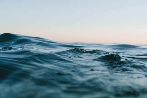
<quiet-aura src="https://images.unsplash.com/photo-1518837695005-2083093ee35b?w=600" count="2">
<div class="card">
<img src="https://images.unsplash.com/photo-1518837695005-2083093ee35b?w=600" alt="" crossorigin="anonymous" />
<div class="caption">
<span>Turquoise Tide</span>
<span>Maldives</span>
</div>
</div>
</quiet-aura>
<!-- Aurora -->
<quiet-aura src="https://images.unsplash.com/photo-1563547257011-054b1054e185?q=80&w=600&auto=format&fit=crop" count="2">
<div class="card">
<img src="https://images.unsplash.com/photo-1563547257011-054b1054e185?q=80&w=600&auto=format&fit=crop" alt="" crossorigin="anonymous" />
<div class="caption">
<span>Aurora</span>
<span>Northern Norway</span>
</div>
</div>
</quiet-aura>
<!-- Forest Canopy -->
<quiet-aura src="https://images.unsplash.com/photo-1473448912268-2022ce9509d8?w=600" count="2">
<div class="card">
<img src="https://images.unsplash.com/photo-1473448912268-2022ce9509d8?w=600" alt="" crossorigin="anonymous" />
<div class="caption">
<span>Forest Canopy</span>
<span>Pacific Northwest</span>
</div>
</div>
</quiet-aura>
</div>
<style>
#aura__gallery {
display: grid;
grid-template-columns: repeat(2, 1fr);
gap: 0.75rem;
padding: 1rem;
@media (max-width: 600px) {
grid-template-columns: 1fr;
}
quiet-aura {
opacity: 0;
transition: opacity 0.6s ease;
&:state(extracted) {
opacity: 1;
}
.card {
border-radius: var(--quiet-border-radius-lg);
overflow: hidden;
box-shadow: 0 2px 12px rgb(0 0 0 / 0.1);
}
}
img {
display: block;
width: 100%;
aspect-ratio: 4 / 3;
object-fit: cover;
border-radius: 0;
}
.caption {
display: flex;
align-items: baseline;
justify-content: space-between;
gap: 0.5rem;
padding: 0.6rem 0.85rem;
background: var(--color-1, #333);
color: var(--text-1, white);
& > span:first-child {
font-weight: 600;
font-size: 0.85rem;
}
& > span:last-child {
font-size: 0.75rem;
opacity: 0.7;
white-space: nowrap;
}
}
}
</style>
API Jump to heading
Importing Jump to heading
The autoloader is the recommended way to import components but, if you prefer to do it manually, the following code snippets will be helpful.
To manually import <quiet-aura> from the CDN, use the following code.
import 'https://cdn.quietui.org/v5.3.1/components/aura/aura.js';
To manually import <quiet-aura> from a self-hosted distribution, use the following
code. Remember to replace /path/to/quiet with the appropriate local path.
import '/path/to/quiet/components/aura/aura.js';Slots Jump to heading
Aura supports the following slots. Learn more about using slots
| Name | Description |
|---|---|
| (default) | Content to display within the aura. Children can use the exposed CSS custom properties for theming. |
Properties Jump to heading
Aura has the following properties that can be set with corresponding attributes. In many cases, the attribute's name is the same as the property's name. If an attribute is different, it will be displayed after the property. Learn more about attributes and properties
| Property | Description | Reflects | Type | Default |
|---|---|---|---|---|
src
|
The URL of the image to extract colors from. |
|
string
|
''
|
count
|
The number of dominant colors to extract, from 1 to 10. |
|
number
|
5
|
sort
|
The order in which extracted colors are sorted. |
|
'dominance' |
                      'hue' |
                      'light-to-dark' |
                      'dark-to-light'
|
'dominance'
|
withOklch
with-oklch
|
When set, exposes --color-N-l, --color-N-c, and
--color-N-h OKLCH custom properties for each extracted color.
|
|
boolean
|
false
|
colors
|
Returns the currently extracted colors. Returns an empty array before extraction completes. |
|
AuraColor[]
|
Methods Jump to heading
Aura supports the following methods. You can obtain a reference to the element and call them like functions in JavaScript. Learn more about methods
| Name | Description | Arguments |
|---|---|---|
extract() |
Forces color extraction from the current image. Useful when the image at the current URL has changed. |
Events Jump to heading
Aura dispatches the following custom events. You can listen to them the same way was native events. Learn more about custom events
| Name | Description |
|---|---|
quiet-loaded |
Emitted when the image has been loaded and colors have been successfully extracted. |
quiet-load-error |
Emitted when the image fails to load or color extraction fails. |
CSS custom properties Jump to heading
Aura supports the following CSS custom properties. You can style them like any other CSS property. Learn more about CSS custom properties
| Name | Description | Default |
|---|---|---|
--color-N |
The Nth extracted color as a hex value (e.g. --color-1 through
--color-10).
|
|
--text-N |
The optimal text color (black or white) for --color-N, based
on its luminance.
|
|
--color-dominant |
The most prominent extracted color as a hex value. | |
--color-accent |
The most vivid color that's distinct from the dominant, or the dominant color when no distinct accent exists (e.g. a single or near-monochrome palette). | |
--color-dark |
The darkest extracted color as a hex value. | |
--color-light |
The lightest extracted color as a hex value. | |
--color-avg |
The average of every pixel in the image as a hex value, ideal for a calm background wash. | |
--text-dominant |
The optimal text color (black or white) for --color-dominant.
|
|
--text-accent |
The optimal text color (black or white) for --color-accent.
|
|
--text-dark |
The optimal text color (black or white) for --color-dark.
|
|
--text-light |
The optimal text color (black or white) for --color-light.
|
|
--text-avg |
The optimal text color (black or white) for --color-avg.
|
|
--color-N-l |
The OKLCH lightness component (0–1) of --color-N. Only set when
with-oklch is enabled.
|
|
--color-N-c |
The OKLCH chroma component (0–0.4) of --color-N. Only set when
with-oklch is enabled.
|
|
--color-N-h |
The OKLCH hue component (0–360) of --color-N. Only set when with-oklch is
enabled.
|
Custom States Jump to heading
Aura has the following custom states. You can target them with CSS using the selectors shown below. Learn more about custom states
| Name | Description | CSS selector |
|---|---|---|
loading |
Applied while the image is loading and colors are being extracted. |
:state(loading)
|
extracted |
Applied when colors have been successfully extracted. |
:state(extracted)
|
error |
Applied when the image failed to load or color extraction failed (e.g. CORS). |
:state(error)
|